Website Re-design
Services
Rebranding
Interface Design
Interaction Design
Design System
Deliverables
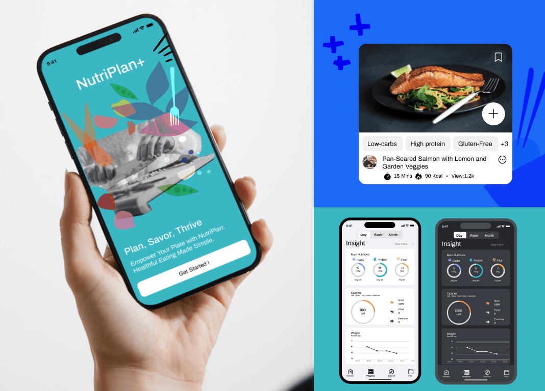
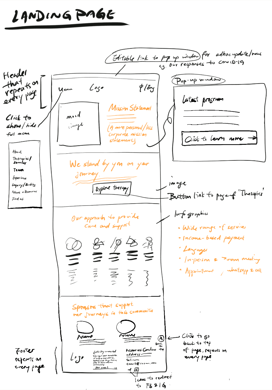
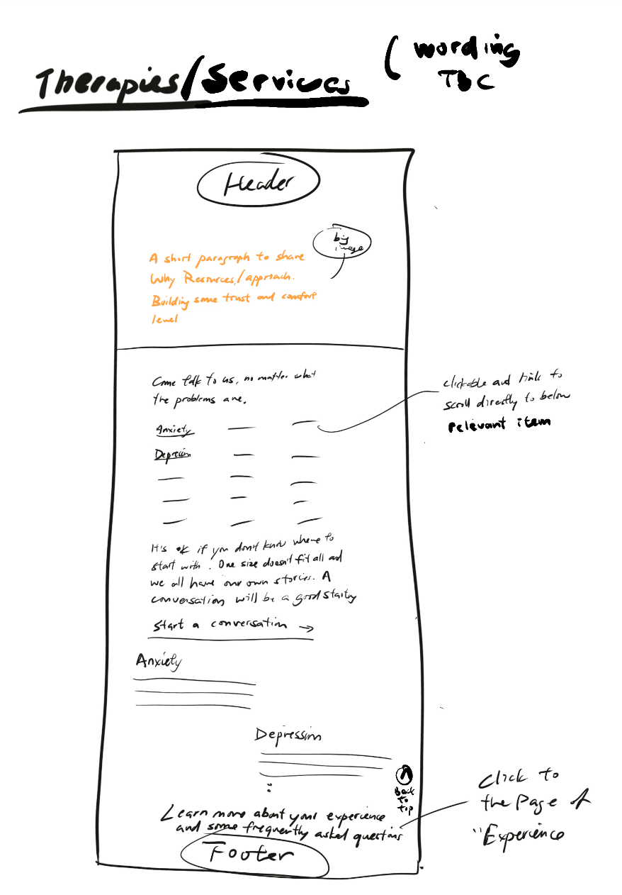
Web
Industry
Mental and well-being
My role
UI design
Graphic design
Tools
Figma
Adobe Illustrator
Wordpress
Duration
Sep - Dec 2022
Team involved


Here's the solution for how we've decided to highlight our uniqueness compared to other counselling centres: place this interactive block within the key features.
Define the problem
Problem statement
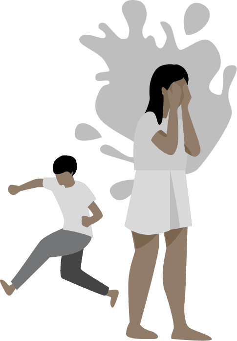
The information architecture and visual presentation cannot deliver the message, first, how we are qualified to support and empower, the public and professionals (doctors/nurses/medical students/teachers); second, what supports do we have and how are we going to help based on variety of issues
User story
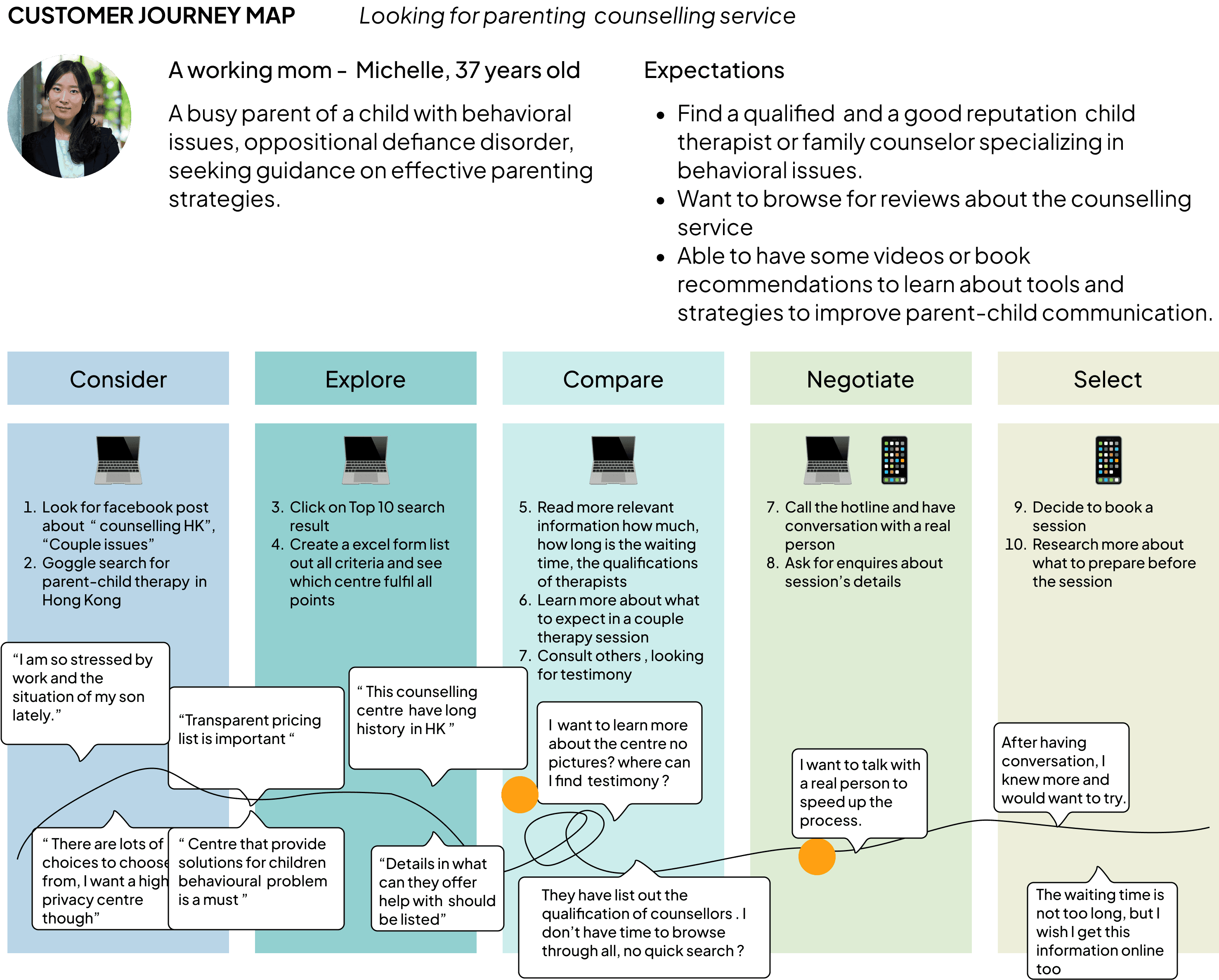
Interview two different group of clients and conducted 30 surveys.
Story 1
Michelle, a dedicated working mother juggling the challenges of parenting and battling work-related burnout. In her pursuit of professional counselling services through organic search, how can our centre distinguish itself from the competition?

Story 2
Sam and Candice were on the verge of getting married, yet a significant conflict loomed over them. They were determined to salvage their ten-year relationship. In her quest for professional guidance, Candice turned to Instagram to discover what resources and experts were available to help them.


“How might we” statement
HMW enhance the overall user experience and engagement on our counselling service center website to better support individuals seeking emotional well-being?
HMW leverage technology and digital tools to improve the efficiency and accessibility of counselling services, making them more readily available to a wider audience?
HMW foster a sense of trust, safety, and community within our online counselling platform to create a supportive environment for both counsellors and clients

"I believe that counselling services should not carry a stigma, and I am eager to participate in this project to enhance ResourceHK's efforts in raising social awareness about seeking help during life crises."

Organisation
ResourceHK out source for a team to revamp their website, since they had used he current website for almost 50 years ago. They want to have a renovation for it, make it look up-to-date. Targeting at increasing clients from public and professionals to know us and when they come across with life crisis they can come to seek for our help.

Our Team
Based on the expectations established by the center as per their requirements, we opted to initiate research into bridging the gap between business expectations and user experience.
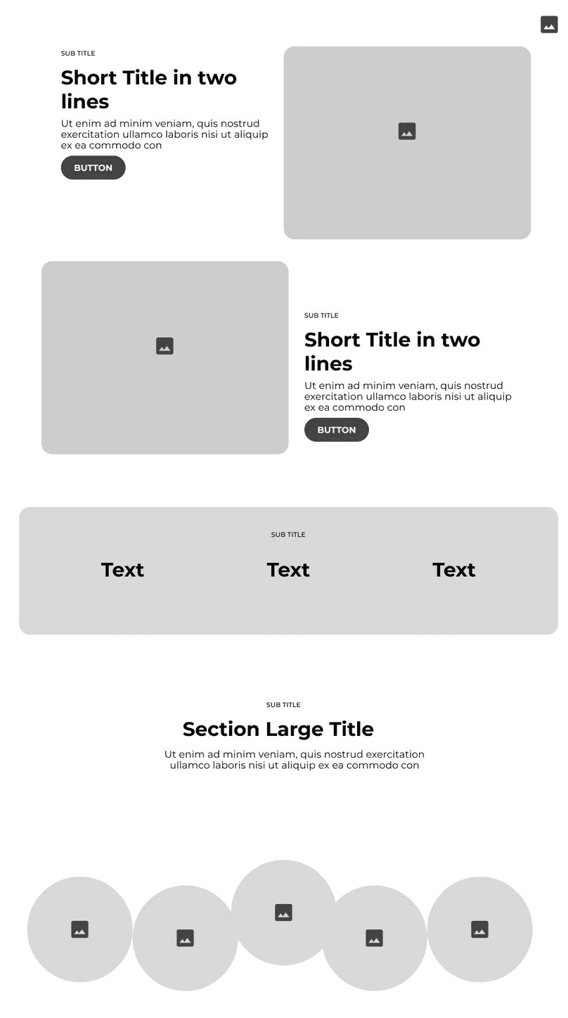
We began creating quick, low-fidelity mockups for user testing, as depicted below.
Users
From the usabliity testing we found out that users with certain issues want to learn about
Common issues are listed on main page
Unique visual presentations
Accessible information
The pricing details not included on landing page
Cannot find any social proof
Not interactive except the CTA button

During usability testing, users encountered difficulties reading the content due to low color contrast. The presentation of the sliding price bar and switching group function was effective. However, there is still room for improvement in the correlation between household income and the session fee per hour.
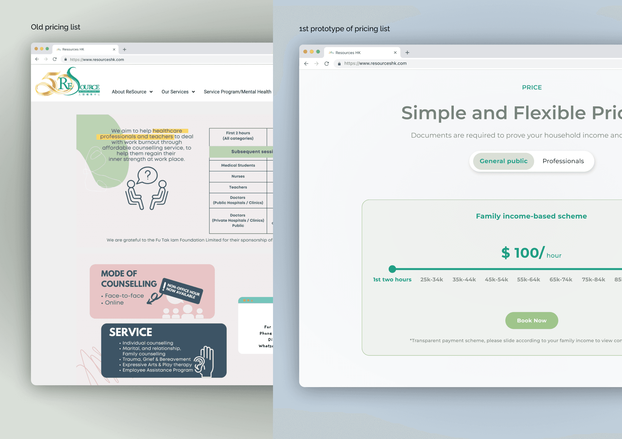
Before
After


Accessibility and Readability
We updated our grey text values to comply with the WCAG color contrast guidelines. This prompted a wider color audit and later, a dramatic change to our color palette, including our 60% orange, 30% green and 10% light orange

Mobile responsive layout
For mobile devices, all interactions have been optimized for various devices.
If there was a sequel …
Things I would do differently
Style Enhancement: Enhance the website's style for a modern and realistic presentation.
Balancing Images and Illustrations: Struggled to strike the right balance between real images and illustrations.
Consistency and Clean Design:Priority was to uphold a consistent and clean design throughout the entire page.
What next, and why
Consider implementing a more modern color scheme and typography to revamp the style.
Experiment with different image-to-illustration ratios on test pages to find what works best.
Conduct usability testing with real users to gather feedback on the website's clarity and cleanliness.